Welcome to Bluelib!
What is Bluelib?
Bluelib is a modular CSS library for web pages which aims to provide great customization and flexibility while trying to keep HTML as "basic" as possible.
This page itself acts both as a documentation of the library and as a live preview of its capabilities.
If you're on a browser which supports that, you can right click any element of this page and then click Inspect Element to see how something is done.
This page is also used for development, therefore it uses un-minified sources and imports some development scripts.
Do not try to determine the performance of Bluelib from this page, as the development features are somewhat heavy on the browser!
Table of contents
Glossary
- Abbreviation
- Anchor
- Annotation, unarticulated
- Area
- Bring attention
- Bluelib
- Box
- Button
- Chapter
- Checkbox
- Citation
- Code
- Color
- Color input
- Definition
- Deleted text
- Details
- Dialog
- Fade
- Field
- File input
- Float
- Form
- Flex form
- Idiomatic expressions
- Input
- Inserted text
- Limited images
- List, definition
- List, ordered
- List, unordered
- Mark
- Multiselect
- Panel
- Parenthesis
- Preformatted text
- Quote
- Radio
- Range
- Ruby
- Ruleset
- Sample, input
- Sample, output
- Select
- Selectorset
- Separator
- Separator, heavy
- Separator, light
- Small comment
- Strike
- Strong importance
- Table
- Table panel
- Target
- Todo
- Variable
Configuration
Targets
Bluelib is composed by many separate CSS documents, each one providing different features which may or may not be desired in a certain website.
A single one of these documents is called a target.
A target is composed by two parts:
- a ruleset, which defines which rules should apply to the page;
- a selectorset, which defines on which elements the changes should be applied to.
Installation and usage
Via UNPKG
You can quickly add Bluelib to a simple website by adding the targets using <link> tags and the UNPKG CDN, like this:
<link rel="stylesheet" href="https://unpkg.com/@steffo/bluelib@VERSION/dist/RULESET.SELECTORSET.min.css" type="text/css" />
To use the targets currently enabled in this page, you should use:
Via a bundler
If you're building a website with a framework such as Next.JS, you'll want first to install Bluelib via your package manager:
$ yarn add @steffo/bluelib
Then, you'll want to import the targets you desire at your website's root:
import "@steffo/bluelib/dist/RULESET.SELECTORSET.css";
To use the targets currently enabled in this page, you should use:
Panels
Panel
A Panel is a container styled with a slight background color and no borders.
Box
A Box is a container adding borders of all four sides to the base appearence of a Panel.
Dialog
A Dialog is a container adding a left border to the base appearence of a Panel.
Snake? Snake??? SNAKEEEEEEE!
Parenthesis
A Parenthesis is a container styled as a Panel and with smaller text.
Panel usage
When using Bluelib, text should always be either an header or inside a Panel.
Since Panels often denote "sections" of text, they should usually be <section> elements.
When they are only used cosmetically, <div> elements should be used instead.
When used to create forms, they may also be <form> elements.
Box usage
A Box creates a visible separation between the content inside it and the content outside it, and should be used when this separation is desired, like when describing a topic (like here).
To achieve the best visual style, Boxes should always be the outmost panels: you should never place a Box inside a Panel or a Dialog, but you can place one inside another Box.
Dialog usage
A Dialog creates a visible indentation of the content inside it, and should be used when this indentation is desired, like in quotes or examples.
When containing a quote, they should use <blockquote> elements.
Like Boxes, Dialogs should never be placed into containers with less borders than them, such as Panels.
Parenthesis usage
A Parenthesis removes importance from its contents, and therefore makes for a great container for notes or additional information about a topic.
Having no borders, they should be considered as Panels when placing them: never add Boxes or Dialogs inside them.
Nesting
As you have seen in the sections before, panels can be nested many times (until the text becomes undistinguishable)!
Like this!
How deep does this Panel hole go?
BWOON.
BWOON.
BWOON.
Chapters
Chapter
A chapter is a grouping of an heading and multiple panels containing tightly related information.
They split their children into a preset amount of columns: this one, for example, splits panels into two columns.
The maximum number of columns in a chapter is 9; beyond that, you'll need to write your own chapter code.
Panel heights
In a chapter, all panels on a row inherit the height of the tallest panel in it, so that no empty space is left.
Element floats
A float is a utility class to align items in panels without having to write CSS.
For example, if a panel has some empty space, elements can be made to float to the bottom, which can be useful for example for buttons in sibling panels.
Auto-wrapping
Panels in a numbered chapter will automatically wrap if their contents won't fit horizontally.
Wrapped panels' heights ignore the height of panels in other rows.
To have a constant height, one has to be set manually.
Auto-sizing
Panels in a "zero" chapter will instead automatically resize to fit everything in a single row.
To set a constant width, one has to be set manually.
Modifiers
Fade
The fade modifier reduces the opacity of the elements it is applied to.
I'm a faded box!
I'm faded too!
But they can be faded more.
Mark
The mark modifier distinguishes the elements it is applied to from the surrounding ones by applying a strong color contrast.
Think of it like an highlighter, but for anything !
Which can be nested to negate its effect.
Up to 3 times and not any more .
To do
The todo modifier emphasises that the contents of the elements it is applied to are not correct or final.
Like this!
As with other modifiers, it is inherited.
And it does nothing if reapplied.
Color modifiers
The color modifiers change the colors of the elements they are applied to.
Red
* warns angrily!
Yellow
* warns.
Green
* is a success!
Cyan
* informs...
Blue
* annotates
Magenta
* asks a question?
Separators
Separator
A separator is a horizontal line that fills all the horizontal space available on a panel, forcing a line wrap.
Top Text
Light separator
A light separator is a less eye-catching separator, to be used if the regular separator distracts too much from the flow of the text.
Bottom Text
Heavy separator
A heavy separator is a very eye-catching separator, to be used if the regular separator isn't apparent enough.
Bottom Text 2: Electric Boogaloo
Lists
Ordered list
A ordered list displays a series of items whose order is relevant.
- First
- Second
- Third
- Fourth
- Fifth
- Sixth
- Seventh
- Eight
- Ninth
- Tenth
- Eleventh
- Twelfth
Unordered list
An unordered list displays a series of items whose order is irrelevant.
- First
- Second
- Third
- Fourth
- Fifth
- Sixth
- Seventh
- Eight
- Ninth
- Tenth
- Eleventh
- Twelfth
Glossaries
Definition list
A definition list displays a series of term-description pairs.
- Term
- Description
- Other term
- Other description
Collapsible details
A details element hides its contents, displaying only a summary until either the marker or the summary itself is activated.
Something
Something else
Something more
Something different
Text elements
Anchors
An anchor is an interactable element which can be clicked to go to a different page, or a different part of the same page, or to perform an action with a different application!
Do you want to go to example.org?
Or perhaps to the chapter about glossaries?
Or perhaps to download Big Buck Bunny with a torrent client?
Idiomatic expressions
An idiomatic expression should be used when a domain-specific term is used.
This is an idiomatic expression.
Emphasis
An emphasis should be used when a certain word should be stressed more than the others in a text.
You're doing what?!
Bring attention
An attention-bringer element denotes parts of text as more important than the others.
I used attention-bringers basically everywhere in this page.
Strong importance
A strong importance element denotes parts of text that are even more important than the ones denoted by attention-bringers.
Pls notice me senpai!!1!
Unarticulated annotations
An unarticulated annotation denotes parts of text that were given an annotation without any comment.
Just look at the headers of level 3 of these panels!
Strike
A strike marks a part of text as incorrect.
I'm plotting to conquer the world completely innocent and not an evil villain!
Inserted and deleted text
When comparing changes to a text, parts of it can be marked as inserted or deleted.
Bluelib 5.0.0
- Added: more bugs
- Removed:
cool features
Small comment
A small comment element denotes a part of a text as less important than the others.
It can be considered the opposite of attention-bringers, and similar to the parenthesis panel.
Bluelib is great! I'm joking, of course.
Preformatted text
A preformatted text element denotes text where lines and positioning are significant; this prevents them from being rearranged by the browser.
It should be used for poetry, code, ASCII art, kaomoji, etc.
   mm    mmmm    mmm  mmmmm  mmmmm
##   #"   " m"   "   #      #
#  #  "#mmm  #        #      #
#mm#      "# #        #      #
#    # "mmm#"  "mmm" mm#mm  mm#mm
Code
A code element denotes that its contents are some kind of code (probably belonging to a programming language).
If displayed as a block instead of inline, it should be used with a preformatted text element.
How to create a section.panel with Bluelib:
<div class="panel">
<p>
Contents
</p>
</div>Keyboard input and sample output
Input samples and output samples from a computer have elements which denote them, and are formatted appropriately.
A sample inside another creates emphasises the individual element, creating a combination.
If you press Ctrl+Alt+Del, something will happen!
If you're on Windows, a menu will appear, and one of the options will say Task Manager.
Variables
A variable denotes a placeholder for something in a formula or algorithm.
Sum: Whatever + Anything = Something
Quotes and citations
A quote element indicates an inline quote, and may be optionally include a citation element indicating the source of the quote.
Objection!
—Phoenix Wright, Ace Attorney
Definitions
A definition element indicates the term that is being defined in the contained paragraph.
This definition example is getting a bit too meta for my tastes.
Abbreviations
An abbreviation element marks its contents as an acronym or abbreviation and allows the user to view the expanded abbreviation by hovering it with the mouse.
Note that no mobile browsers currently support this feature, so you'll have to manually provide an alternative for mobile users to see the full abbreviation.
Two companies against each other: BLU vs. RED!
Ruby
A ruby text element is text with small annotations above, commonly used in East Asian texts.
Mo de na
漢 字
明日
Tables
Table
A table is an element whose children are aligned in a grid.
| Emoji | Meaning |
|---|---|
| 🙂 | Slightly Smiling Face |
| 🌑 | New Moon |
| 🌚 | New Moon with Face |
Table caption
Tables can have captions attached to their top.
| Emoji | Meaning |
|---|---|
| 🍎 | Red Apple |
| 🍏 | Green Apple |
| | Hopefully a square with F8FF written inside it |
Tables can also have headings and captions attached to their bottom.
| 🍐 | Pear |
| Emoji | Meaning |
|---|
| Mario | Luigi | |
|---|---|---|
| Tables | They're cool and allow you to do cool stuff | They need chairs to be useful |
| Flexboxes | They're very useful | Not enough flexible for me |
| Grids | I love them | Bleargh |
| Overall | <3 | 0/10 |
| Feature | Description |
|---|---|
| Base | All the base features of your home robot! |
| Extra | Everything a robot should be able to do, plus an infinite bubblewrap dispenser! |
| Super | The robot is now armed with a non-free printer, and is ready to conquer the world! |
| Ultimate | A time machine has been embedded into the robot, and it is free to use it at will. |
| O | X | |
| X | X | O |
| X | O |
Images
Default
Images are automatically centered and resized to fit the panel they are in.
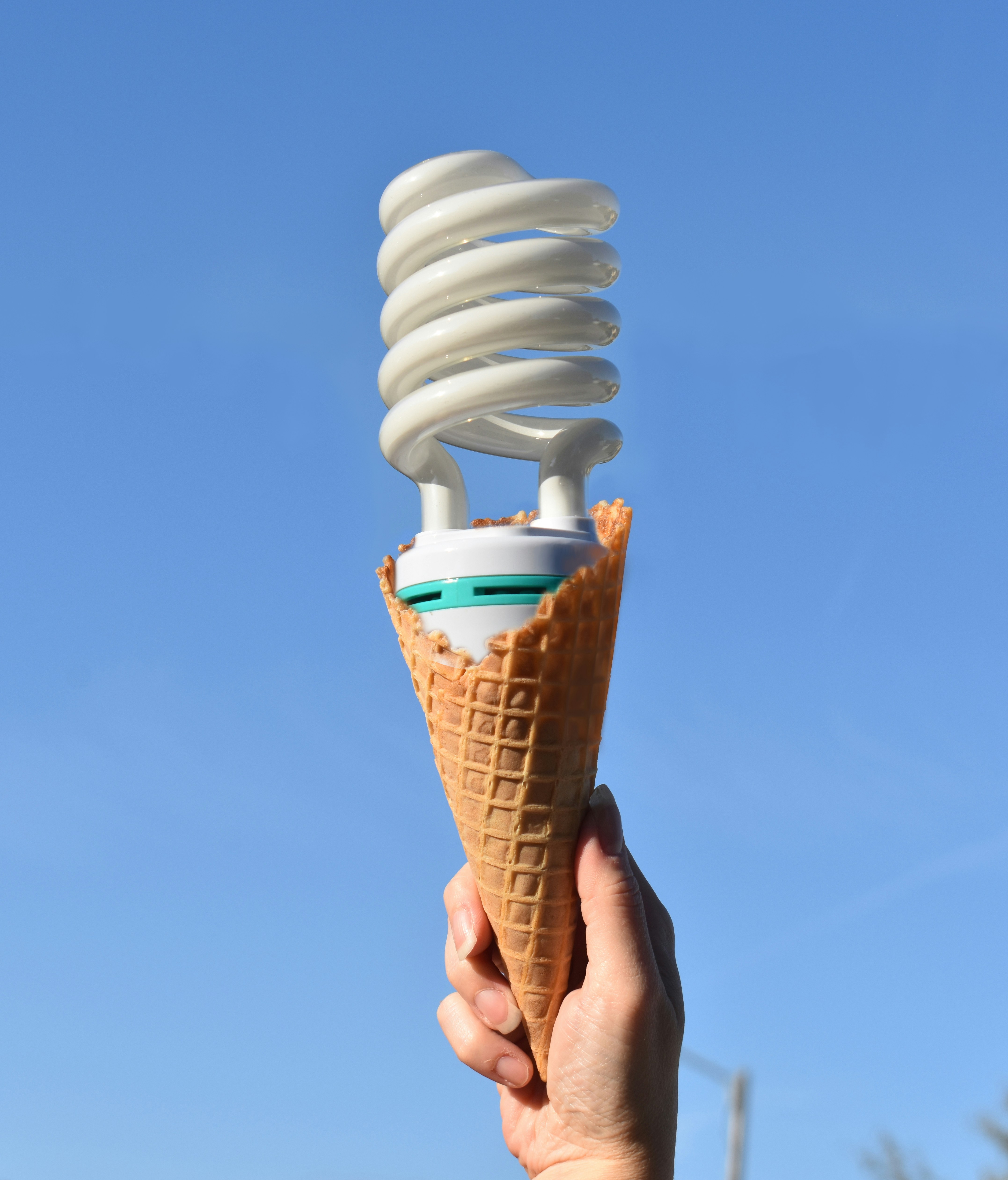
Limited
Images can be limited to prevent them from taking up too much screen space, like the previous one did.
Half
The following image has a limit of half the vertical viewport:
Quarter
The following image has a limit of a quarter of the vertical viewport:
Inputs
Input
An Input is an interactive element which allows the user to interact with the web page.
Field
A Field is an Input which allows the user to enter single-line free-form text.
Special types of Fields
A Field may require a particular type of data, such as an email or a phone number.
Area
An Area is a resizable Input which allows the user to enter multi-line free-form text.
Select
A Select is an Input which allow the user to select between one of multiple options.
Multiselect
A Multiselect is an Input which allows the user to enable or disable multiple options.
Be aware that the average user will probably not know how to interact with the Multiselect: to select options not adjacent to each other on a desktop browser, it requires holding the Ctrl key.
Radio
Radios are Inputs which, like a Select, allow the user to select between one of multiple options when grouped together.
Checkbox
Checkboxes are Inputs which, like a Multiselect, allows the user to enable or disable multiple options when grouped together.
Color
A color input is an Input which allows the user to select a RGB color.
Since browsers usually delegate the rendering of this element to the operating system, it cannot be styled.
File
A file input is an Input which allows the user to upload a file from their computer.
Since browsers usually delegate the rendering of this element to the operating system, it cannot be styled.
Range
A Range is an Input which allows the user to inaccurately select a value from a given range.
Button
A Button is an Input which the user can click to trigger an action.
Forms
Form
An form is a non-interactive element which positions Inputs in commonly used ways.
Flex form
A flex form is a block form aligning labels and inputs to a pseudo-grid.
Row form
A row form is a block form aligning elements to a single horizontal row.